Works · Branding / Web / WebGL · 2024
CraftBank
Brand, three websites, product UI/UX and a design system for CraftBank, digitising the construction trade
Abstract
Working across both brand and product at CraftBank, whose stated vision is to turn construction into an industry that keeps making money as the times change. The corporate site, the service site and the engineer recruiting site are all mine, as are the UI/UX and the design system of their management system, CraftBank Office. Most recently, to cut the hours designers spend, the product team and the brand team each got their own Claude Code directory, so a wide range of design work now runs on far less time.
Background
Construction has long worked in an unusually complicated way — back-office processes, layered subcontracting, conventions particular to the industry. CraftBank is undoing that by driving digital transformation and staying alongside its customers as they adopt it. My contribution as a designer is to make the product less difficult to use, and to raise the value of the brand.
Method
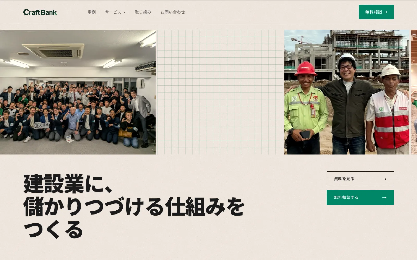
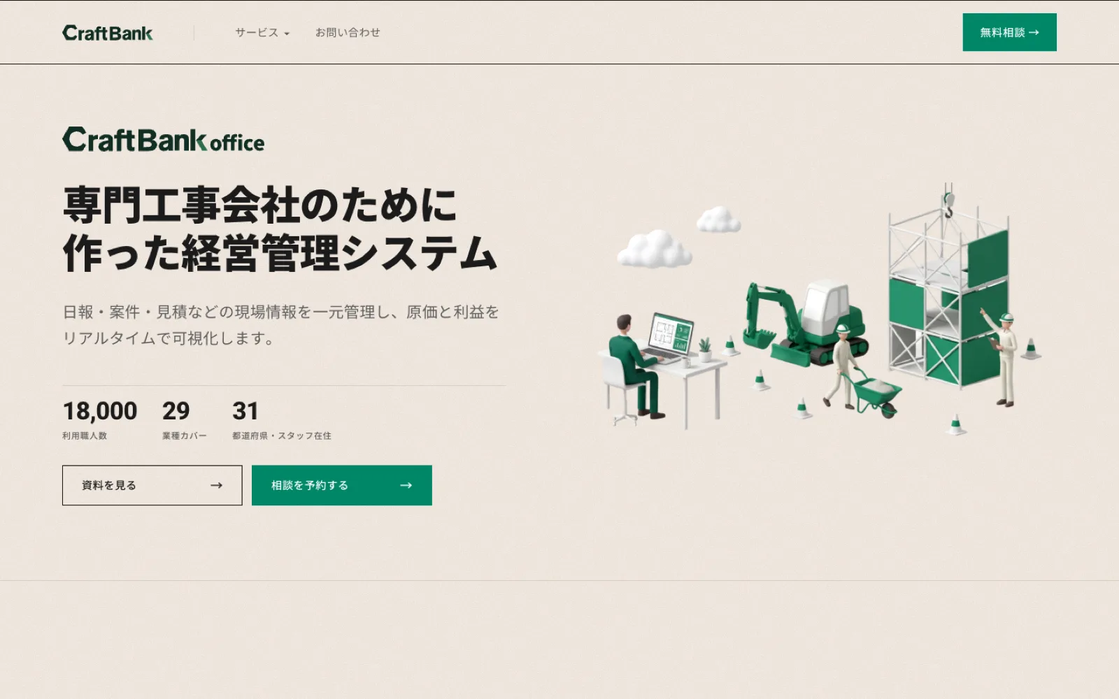
There are three sites. The corporate site leads with one sentence — building a system that keeps construction profitable — over photographs of the sites and the people. The service site puts real figures in the first view (craftsmen using it, trades covered, prefectures reached) so the scale lands before any feature does.
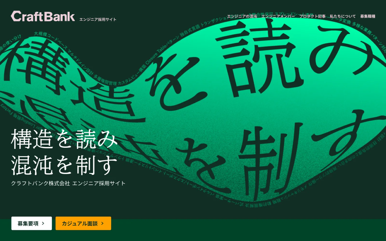
The engineer recruiting site deliberately breaks from the other two. It aims squarely at people who enjoy untangling difficult problems, showing how complicated construction software really is before a word of it is explained.
On the product side, the work is the UI/UX of CraftBank Office. Its users run from their twenties to their seventies — craftsmen on phones, owners and back office on desktops — so every screen was designed on one condition: the same steps must work on either.
Its design system is being built now, with Claude Code. It splits into four layers — world, tokens, patterns, quality — each carrying its reasoning as written documentation, so that the same judgements survive as the team grows.
Outcome
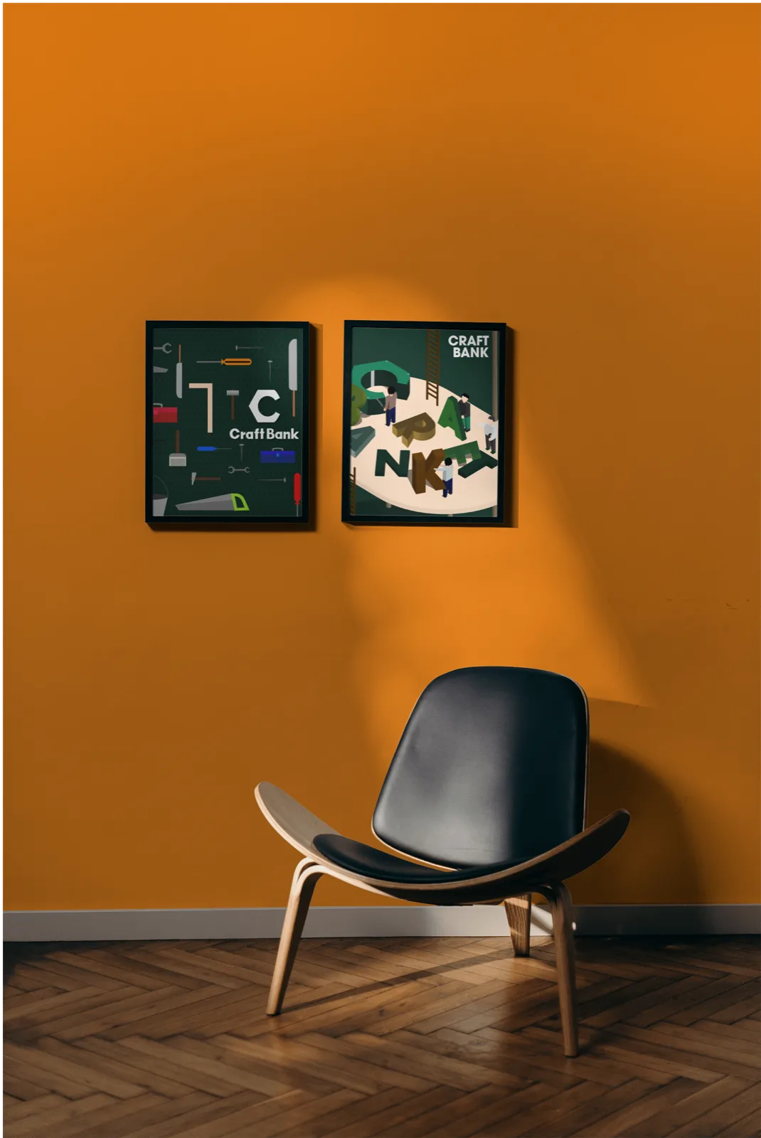
From the logotype down to the interface parts, everything can be explained by one set of rules. Brand and product no longer grow apart; they share a single basis, and whoever touches it next finds the reasoning already written down.