Log · Research / Colour · 2018.02
Extracting Palettes from World Heritage
Palettes pulled from World Heritage landscapes, after kasane-no-irome
The colours of nature, in fashion, come down to green for leaves, blue for sky and sea, beige for earth. That is about the extent of it. This project pulls palettes out of World Natural Heritage photographs instead, keeping only colours that were actually there.
Nature reduced to a handful of colours
The range is narrow when fashion speaks of natural colour: the green of grass and trees, the blue of sky and sea, the beige and brown of soil. Nature holds far finer distinctions, and only this handful is ever picked up by the time it reaches clothing.
Could the rest of that range be taken from the natural subject itself? Palettes built from it might produce clothing that is natural in colour and still unlike anything worn so far.
A thousand-year-old precedent
Choosing a palette by feel leaves nothing to argue with. The reference is kasane-no-irome, the layered colour system of the Heian period.
It assigns a name and a season to each pairing of the outer and inner colours of layered robes. Not which colour is beautiful, but what a given combination denotes, decided in advance. A precedent for handling colour by rule rather than by taste, a thousand years old and Japanese.
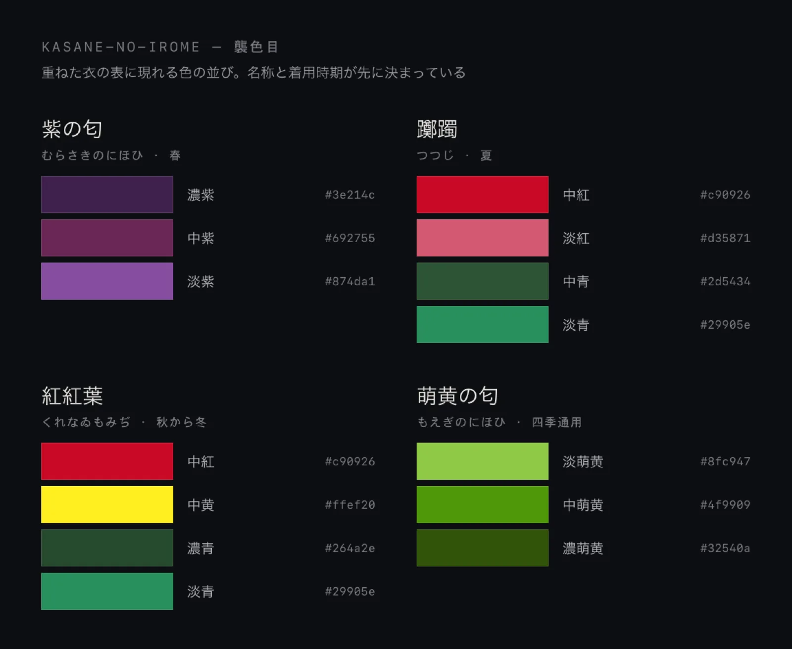
Extracting the palette
The method is simple. Interpolate a World Heritage photograph down to two pixels, six pixels, eighteen pixels. Line up the colours that remain and you have a two-, six- and eighteen-colour palette. Three per site.
The interpolation is nearest-neighbour: it carries the nearest pixel across unchanged and never averages. Every colour that comes out was genuinely present in that landscape. Not one blended colour enters. That is why the method was chosen.
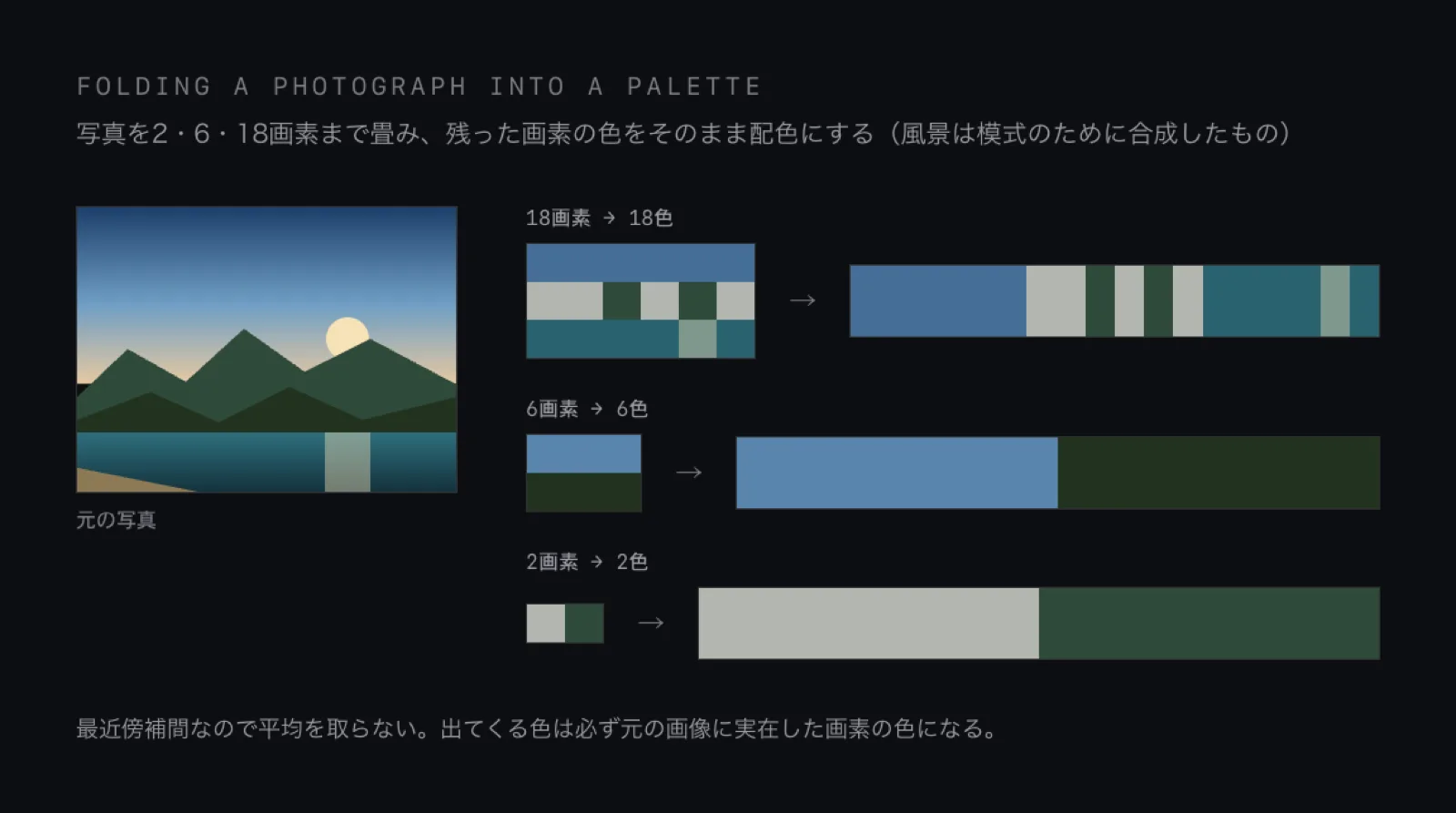
The three steps exist because the grain differs. Folded to two, only the most forceful colours survive; left at eighteen, the palette stays close to the impression of the photograph. One landscape yields three palettes of different coarseness.
Putting it on clothes
The palettes are applied to fashion coordination and shown to people. In most cases the impression that comes back is that they feel fresh, unlike the usual, which suggests the palettes carry some practical value.
What this project does not settle
Because the palettes are extracted from photographs, the same site yields different colours depending on which photograph is used. Real colour also shifts with the hour and the season.
Going to the sites and reading the actual colour values without a photograph in between would give palettes that could be trusted further.
Sources
The World Natural Heritage photographs used for extraction come from the natural heritage list on Sekai Isan Navi pamon (pamon.sekaken.jp, run by the World Heritage Study secretariat and Mynavi Publishing). The images there are credited to AdobeStock, pixabay, unsplash and iStock.
The kasane-no-irome colour codes are after Ateitexe, which approximates them from color-sample.com and notes that accounts of the shades differ.